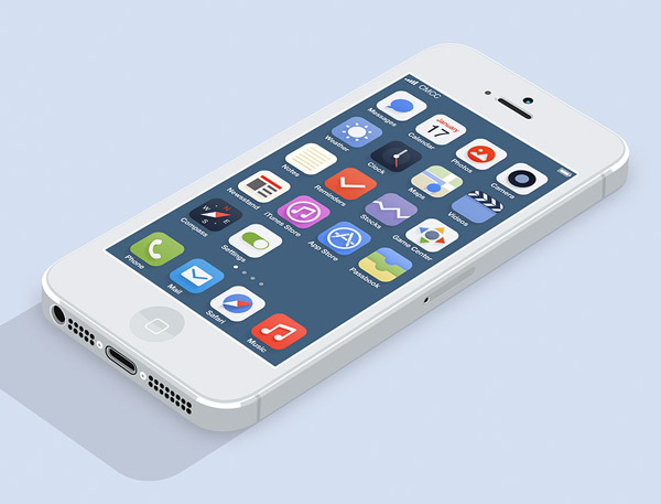
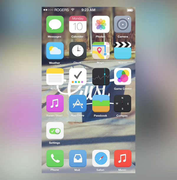
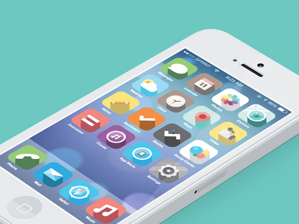
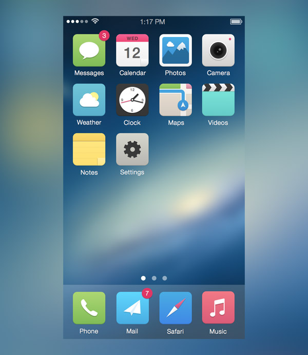
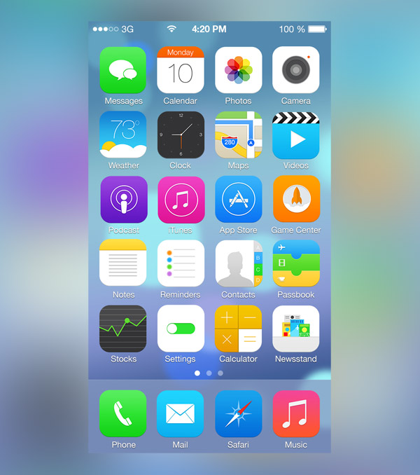
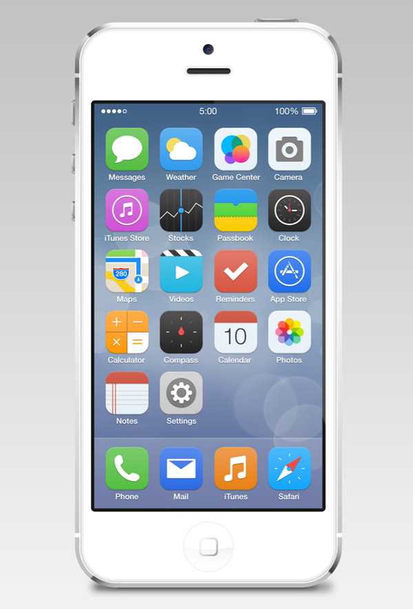
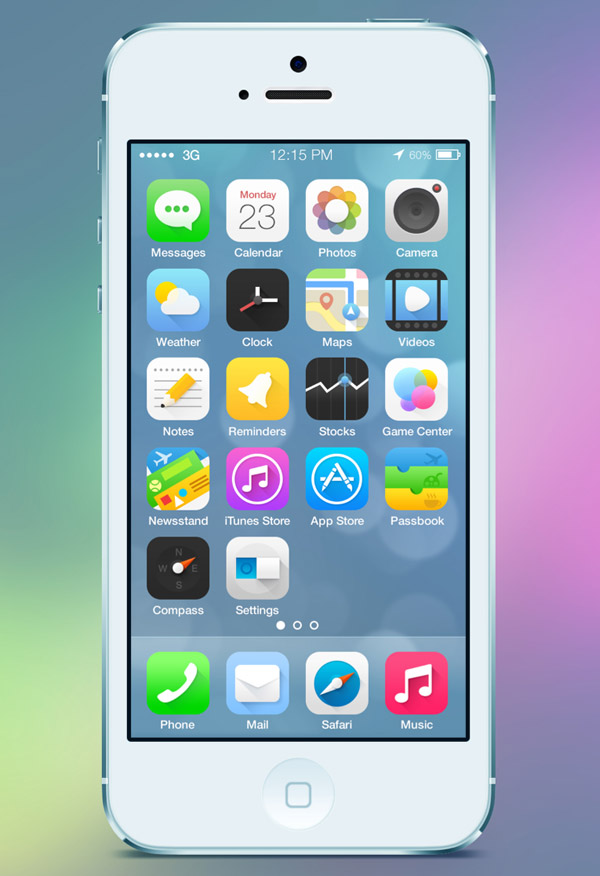
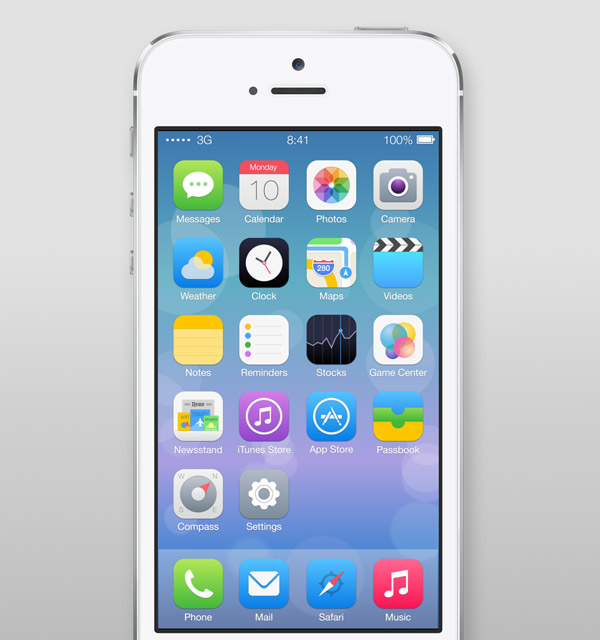
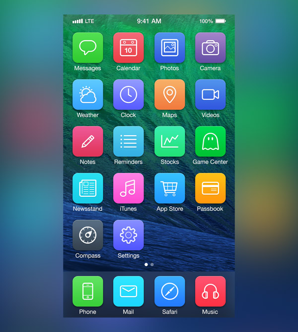
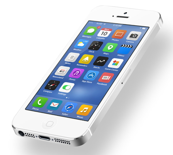
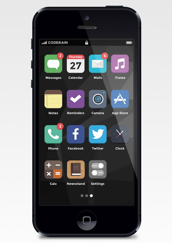
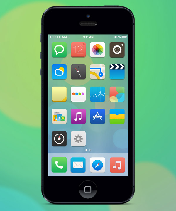
This post rounds up a collection of great redesigns of iOS icons, lock screens, control centers as well check out various polished app interfaces that were inspired by Apple’s new aesthetics, you will find some great ideas and alternatives to Apple’s initial concept. The garish colour palette, the plain ugly icons and the questionable design decisions have resulted in designers expressing their frustration and sharing their own interpretations of the iOS interface via social websites such as Dribbble and Behance. Those, who insatiable offer various iOS interface concepts, mainly based on refined flat style and vivid colors.
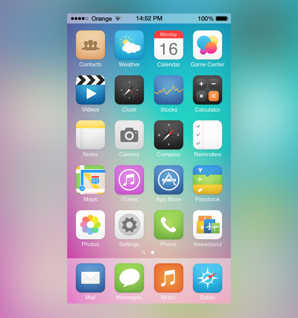
iOS Redesign by Johnny
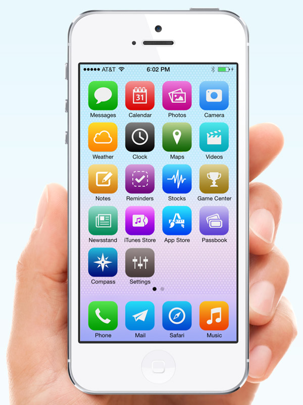
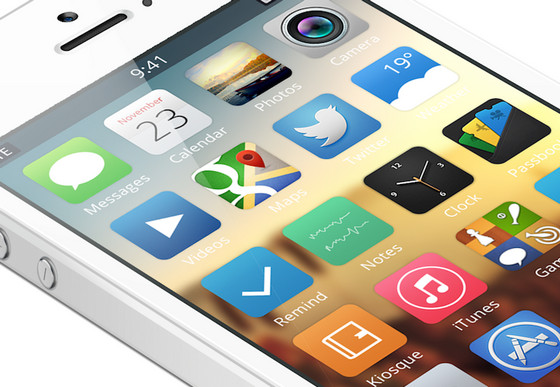
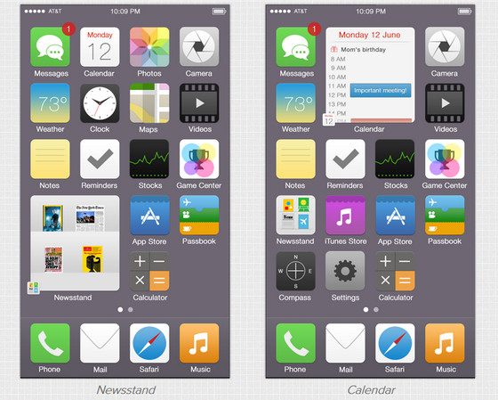
iOS Homescreen Redesign by Gil
iOS by Jacob Cummings
iOS Alternative Icons by Carlos Gavina
iOS V2 by Ross Legacy
iOS Reimagined by Zane David
iOS Icons by Alexandr Nohrin
iOS Icons Redesign by Ida Swarczewskaja
iOS Flat by Dámaso Benítez
iOS Redesign by Michael Boswell
iOS Redesign by Leo Drapeau
iOS Icons by Jackie Tran Anh
iOS Redesign by Michael Boswell
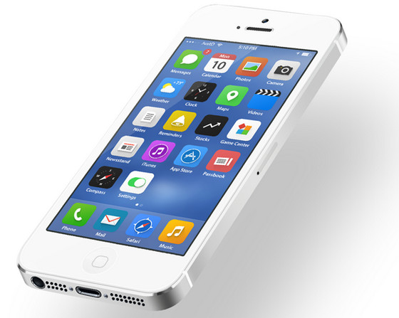
iOS by JustD
iOS Flat Icons by Mialszygrosz
My Own iOS by Juan Pisanu
iOS Icons by Michael Shanks
iOS Icons Redesign by Christophe Tauziet
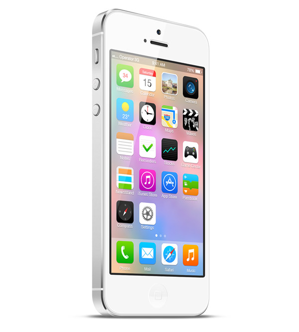
iOS Concept by Alex Martinov
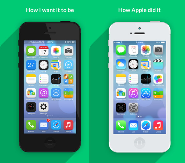
How I want iOS to look by Jeffrey de Goot
Final Icons by Vaibhav Bhat
iOS Redesign by Pascal Assaleh
iOS Redesign by Fareast Binsteera
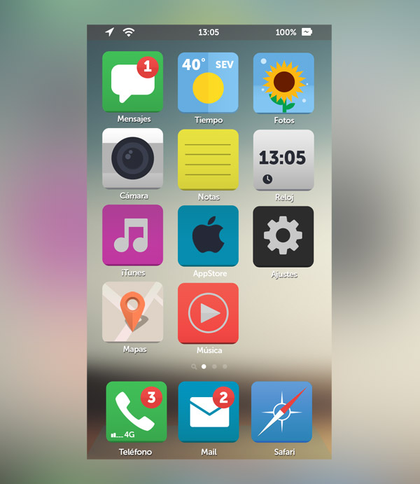
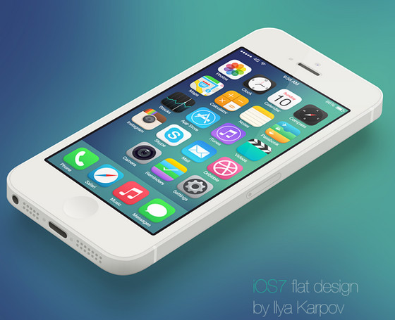
iOS flat design by Ilya Karpov is another modern take on flat style. Although, the upper part of the icon is plane, it has obvious 3-dimensional touch due to fatty bottom border.
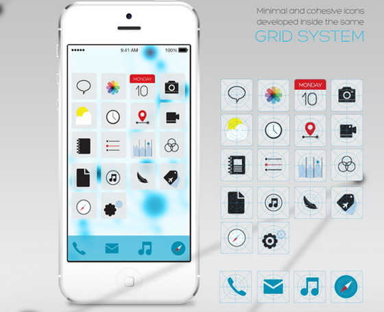
iOS icons redesign by Ida Swarczewskaja has neat and organized appearance. Vector icons look crisp and polished.
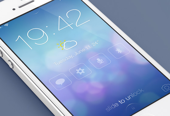
iOS Lock screen – Redesign by Mariusz instantly grabs user’s attention through its elegant look. Beautiful bokeh themed background nicely complements outline graphics and slightly transparent glyphs.
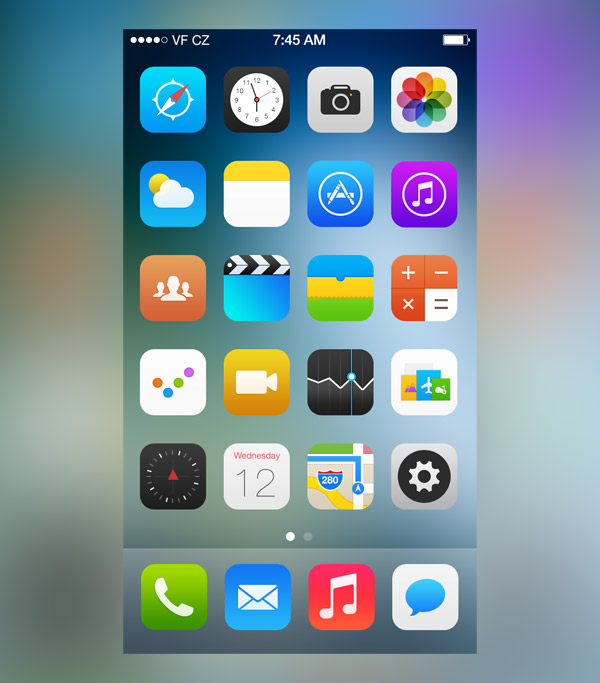
iOS icons by Alexandr Nohrin is a great take on redesigning essential icons. Majority of them has got its own approach and eye-catching look.
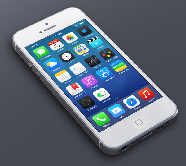
iOS Concept by Alex Martinov exhibits sophisticated home screen template with new improved icons. The latter have subtle shadows that help graphics to nicely stand out.
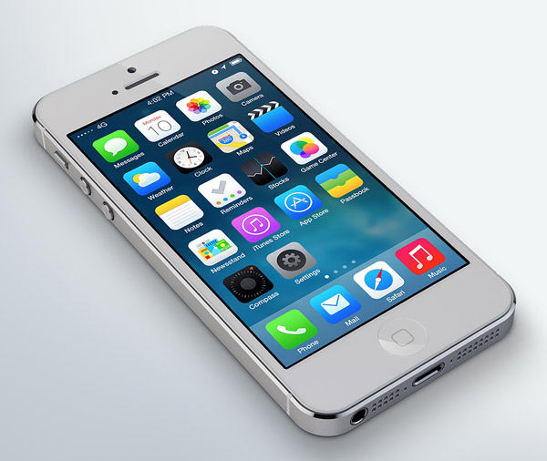
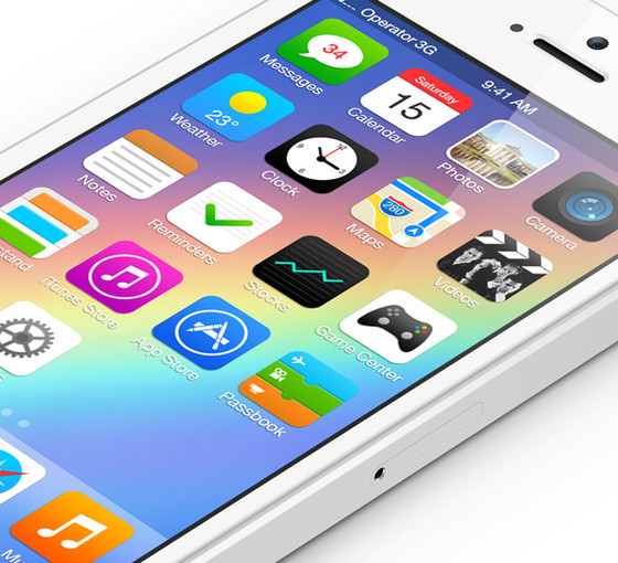
iOS – Redesign by Dmitry Kovalenko fascinates with polished refined appearance. Designer follows new Apple guidelines and recreates enhanced outward for each icon.
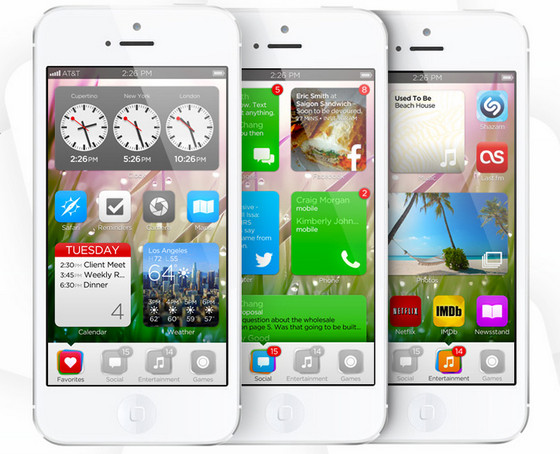
iOS Imagined by Tiny Team is a conceptual reflection on offbeat combination of iOS and metro 8 style, featuring various app modes and visually appealing color distinction.
iOS – Dark Theme by Huig van der Waal does a good job of recreating a truly uncluttered design. Interface looks minimal and enormously refreshing.
iOS Concept by mcase offers its own fantastic set of standard icons with a subtle gradients and soft shadows.
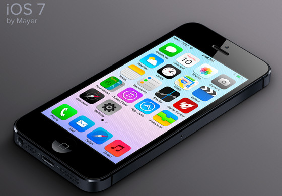
iOS Redesign by Mayer – Although Mayer’s work is based on neon colored gradient background of current OS, its pack of icons looks polished and thoroughly revised.
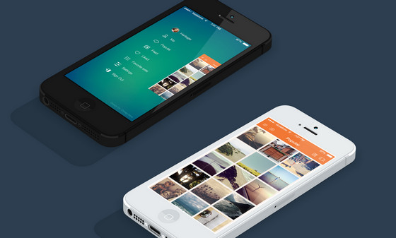
Instasave iPhone App by chirag dave – uijunction has been developed for photoholics. Exquisite side menu and dark, gradient themed background lovely collaborate with each other.
iPhone Discovery Interface by Eric Hoffman has wonderful glossy vibe with a bunch of high-quality photos. Navigation panel, tab bar, as well as typography look simply amazing.
iOS Redesign by Isis Marques is guided by 4 main aspects: circles, lines, few colors and simplicity. As a result, interface has got exceptional offbeat appearance which is spiced up with truly unconventional icons.
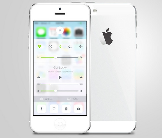
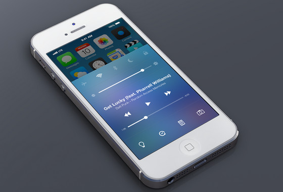
iOS Control Center Redesign by Sam Nissinen demonstrates beautiful refined command centre. Semi-transparent light background, injections of vivid green color and subtle graphics add to interface style and attractiveness.
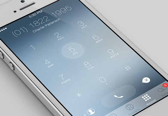
iOS Keypad Redesign by Charles Patterson is based on minimal approach, including clean smooth shapes, ultra-narrow type, a lot of free space and clean tab bar icons.
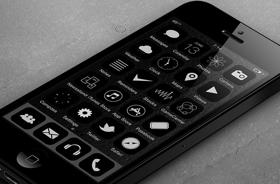
iOS BKNY mod by Xander Vinogradov is defined by classic black-and-white color palette that gives interface unique unconventional appearance. Neat, flat, outline, white icons set on dark background definitely looks fresh and exquisite.
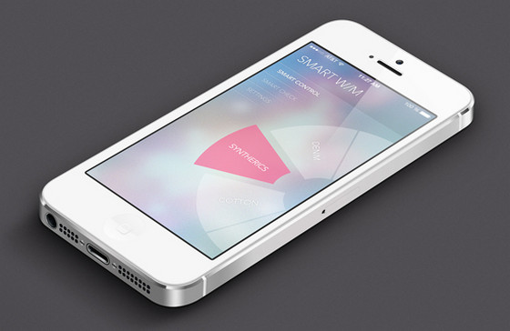
Smart washer app UI by Hyelim Choi is also inspired by simplicity and flatness of iOS. Heavily blurred, bokeh background, slightly transparent blocks and regular white type make project look polished and refined.
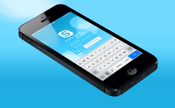
Skype Redesign iOS by Tadas Jotkevicius is a refreshing take on a Skype app interface, which fits perfectly into the concept of the new OS, capably utilizing brand blue colors, bokeh touch and plane graphics.
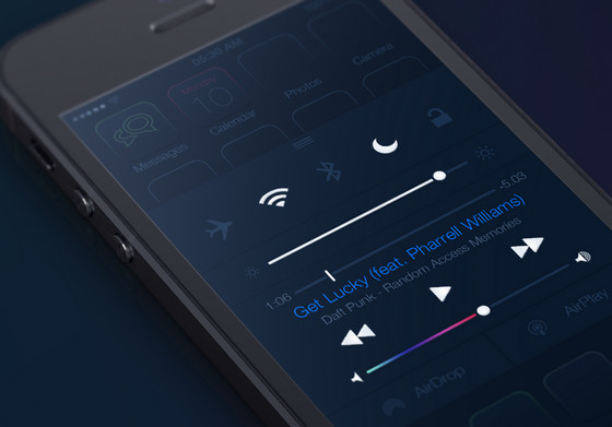
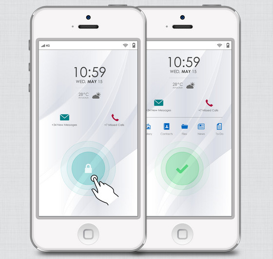
iOS : Just a concept by Peyman Eskandari showcases redesigned lock screen that provides users with fast access to essential functions. All in all, interface looks spacious mainly due to lack of embellishments.
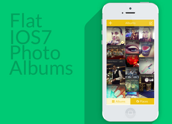
Photo Gallery Concept by AlHasan AlDasooqi is a clean, grid-based concept of a standard photo gallery, inspired by new iOS and vibrant colors of Metro 8.
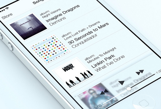
Music player iOS Style by Alex Bender also has sophisticated flat vibe. Habitual, stripe layout keeps things organized and open. Translucent command panel in conjunction with plane controllers beautifully complements the whole design.
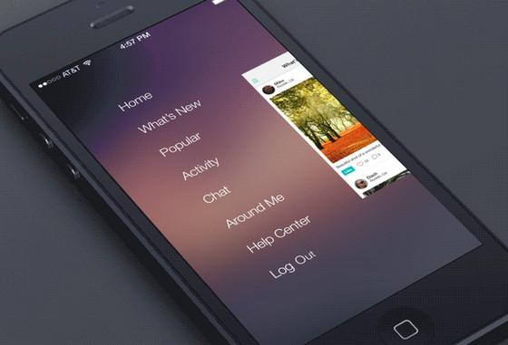
Social Feed (iOS) by Dash features updated social feed widget that leverages amazing subtle, gradient themed background and sliding panels with nice transition. Light white type, used in menu, harmoniously stands out in a background.
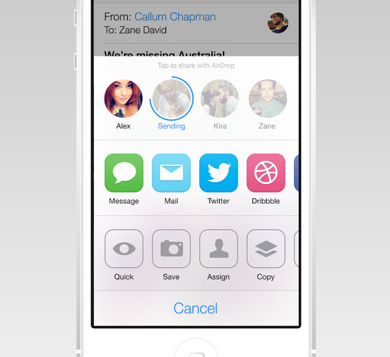
iOS AirDrop/Share Redesign by Zane David skillfully gives new interface its own personal touch. Designer doesn’t include bokeh or gradient effect; instead he employs solid color background, calming colors, clean smooth icons and circular shapes.
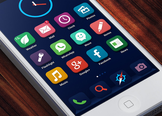
iOS Concept by Ariel Verber ably leverages dark saturated colors that wonderfully interact with each other. Although, icons got flatter look they still have a third dimensional feeling.
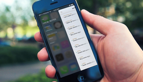
Notes iOS (wip) by Luboš Volkov portrays notes concept with a sharp contrast between backgrounds. Designer beautifully utilizes side menu and blurred background.
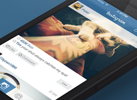
Instagram iOS by ididi is another creative exploration in trendy flat style. Slightly transparent title bar, regular font and white content background do not distract attention from photo.
iOS Reimagined by Tristan Edwards is a concept that definitely worth considering. Designer offers alternative variants of various iOS interfaces that radiate with elegance and neatness.
iOS Control Center Redesign by Michael Boswell utilizes vibrant bluish glossy background that easily sets apart essential controllers, made in a simple white color.
